
Kinetic Brand Refresh
This project showcases a strong commitment to creating a modern and smooth visual style that emphasizes connection and conveys a confident presence in the online domain. The focus on connectivity and local language is evident, highlighted by harmonious and bold billboards, web, and print pieces. The use of electric green adds a sense of urgency, setting Kinetic apart and giving it a unique edge in its category.


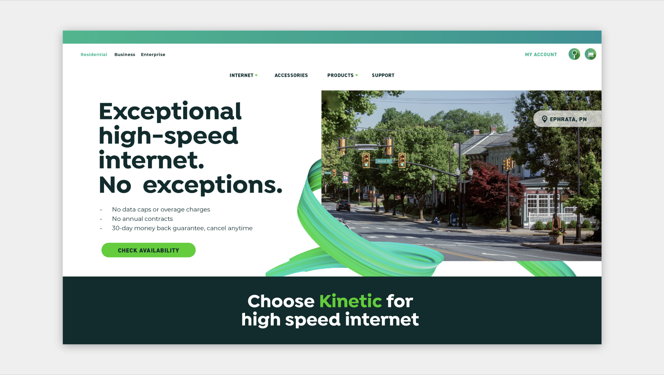
How to leverage “connectivity” in a visual way
Other wifi companies represent the wave of wifi in different ways. T-mobile uses a pink haze, others use a swoosh and some companies lack that representation . Is there an opportunity for Kinetic to show connectivity in a unique way visually?
What I Learned
Your UX cannot stink.
The web and app experiences need to feel seamless, streamlined, and premium. Looking at competitors, a bad website feels like a precursor to a bad experience. Prioritize UX experience.
Lots of offers do not
have to = clutter.
Clean, modern design also not super common in the space, but brands tend to put tons of visuals and info on every piece. How can we find that middle ground of clean, yet informational, yet bold?