Uncommon Teams
Art Director: Matt Mcmullen
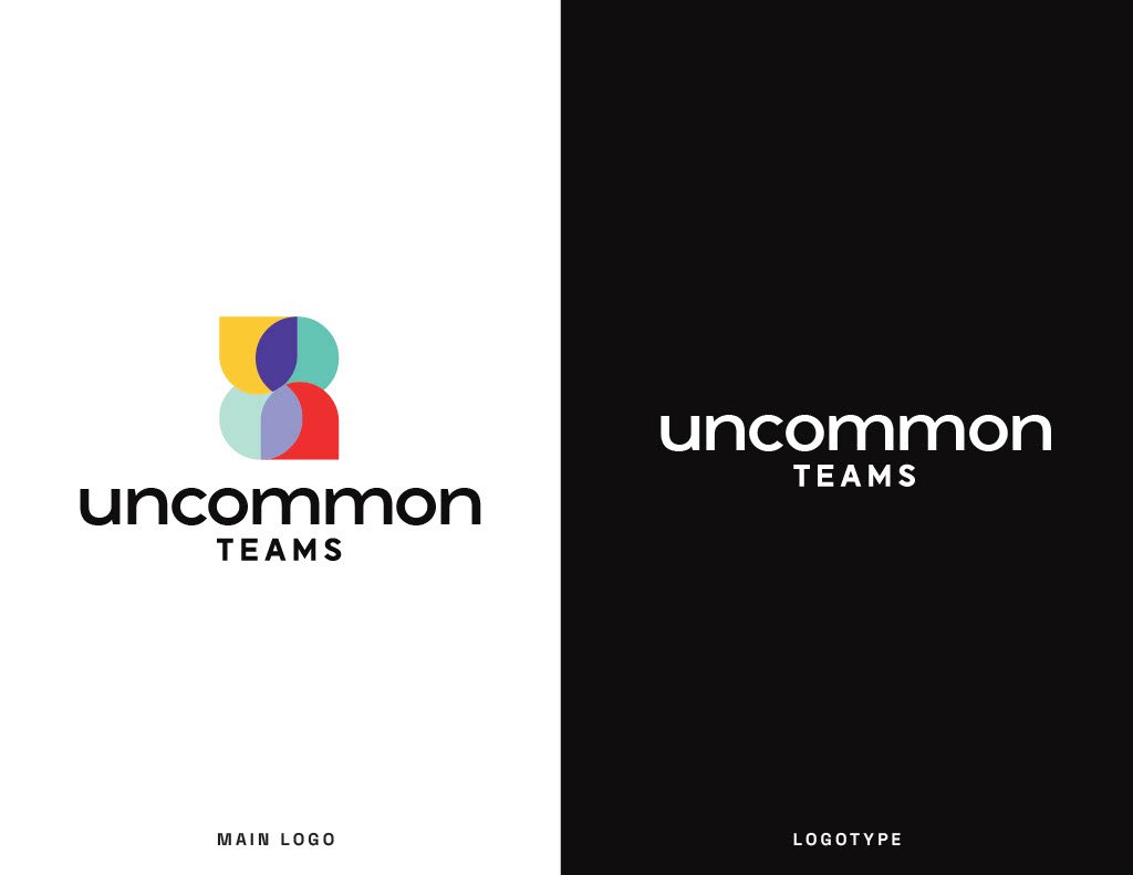
Uncommon Teams helps build confidence with software leaders. This brand needed to reflect the importance of teamwork and collaboration among leaders. In creating the icon, I put in a lot of thought towards the values of being on a team. The icon represents two people overlapping and sharing knowledge with one another, thus creating an uncommon team. All the different colors overlapping are a success web of what leadership means. For example, the yellow could mean movement, the red alignment, teal is impact, all moving towards leading uncommonly.